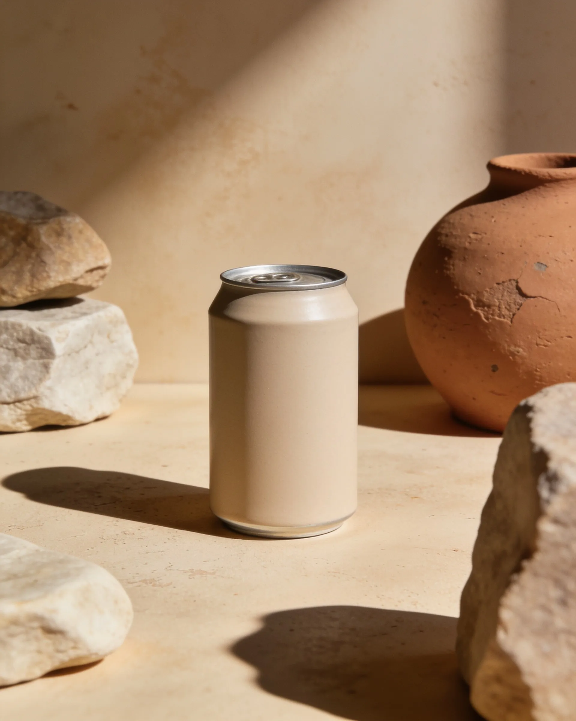
STRATEGY · 2025
A new position for a different kind of social drink.
Positioning, packaging and launch direction for a botanical drinks brand moving beyond the alcohol-free alternative.
The problem
The early messaging explained what the drink wasn’t,
without giving people a memorable reason to choose it.
Packaging and messaging shifted from one channel to the next.
The goal
Improve how clearly people understood the product, lift online conversion,
and generate more interest from prospective stockists.
The scope
- 01Category research
- 02Positioning
- 03Message architecture
- 04Packaging visual direction
- 05Launch communication

Results
Ecommerce conversion
1.8% to 2.4%
Qualified stockist inquiries
18 to 27
Proposition clarity
42% to 68%
Illustrative results from a fictional project.
“Once the packaging and the message finally matched, people stopped asking what Aster was and started asking where to buy it — our stockist inquiries jumped 50% in eight weeks, and our own site converted a third better.”
Isabelle Ferrand — Founder, Aster